
May 28, 2010
From Print to Digital
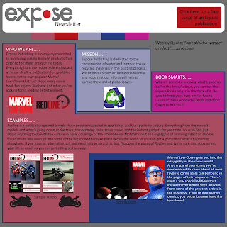
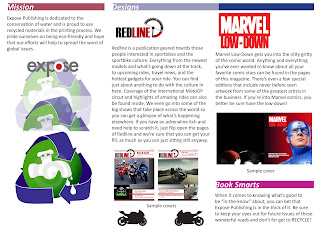
This week, we took our original brochure design and incorporated what it would look like if it changed to a digital newsletter. Keeping a lot of the elements of the brochure, it was actually fun to morph it to a digital piece. Since I wasn't entirely happy with my brochure to begin with, it gave me the chance to tweak it some to the point where I was a little happier with it. I tried to make the newsletter easy to follow and read while still making it interesting. I gave just enough info to interest the reader in further looking into what Expose Publishing offers.
May 21, 2010
Website ideas and brochure
OK, so I haven't been a very good blogger, and I apologize for that, but I'm really not good at this sort of thing, but here goes....
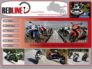
Over the past few weeks, we've been given a few assignments, some of these consisted of making a web page that would be cohesive with out publication. In other words, we needed to design at least two home pages that use the same colors, similar layouts, and have a theme that matches our own publications. Keeping in mind the amount of screen space used, where ads and buttons would go, and what content we wanted used. I think they turned out pretty good, but you be the judge...

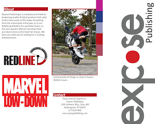
As for another assignment, we needed to come up with a tri-fold brochure that tells about our "class" publication company Expose. We decided as a class that we would be eco-friendly, therefore use recycled paper and be involved in water conservation. Being that I only have the limited time in class and no computer/software at home to work on these projects, I just quickly threw together an idea, and here it is.
I'm not exactly happy with it, but being that many of these assignments are "works in progress" that can be revised, it's alright as far as layout goes for design one. Until next time. Thanks for reading!
Over the past few weeks, we've been given a few assignments, some of these consisted of making a web page that would be cohesive with out publication. In other words, we needed to design at least two home pages that use the same colors, similar layouts, and have a theme that matches our own publications. Keeping in mind the amount of screen space used, where ads and buttons would go, and what content we wanted used. I think they turned out pretty good, but you be the judge...


As for another assignment, we needed to come up with a tri-fold brochure that tells about our "class" publication company Expose. We decided as a class that we would be eco-friendly, therefore use recycled paper and be involved in water conservation. Being that I only have the limited time in class and no computer/software at home to work on these projects, I just quickly threw together an idea, and here it is.


I'm not exactly happy with it, but being that many of these assignments are "works in progress" that can be revised, it's alright as far as layout goes for design one. Until next time. Thanks for reading!
Subscribe to:
Comments (Atom)