June 04, 2010
Moving Right Along.....
Alright, so we're working on getting everything ready for our final now, trying to get everything caught up and looking nice. I'm working on my front/back covers and TOC's that I didn't quite get completed. Since we're only using one of each for our final, it's an important decision, so I want to be sure to make/choose the right one. Once I get a few more done, I'll post them here for critique. Until then......
Work, Work, Work
OK, so this week, we've been given assignments based on the digital aspects of publication, mainly the mobile modern devices of the day that allow you to be just about anywhere and get your info.
Our first assignment was to design a banner ad of our choice and animate it using stills. Basically, use PDFs to show how it would progress on a site. I decided to advertise my own publication as if it were on another site. This is how it turned out.
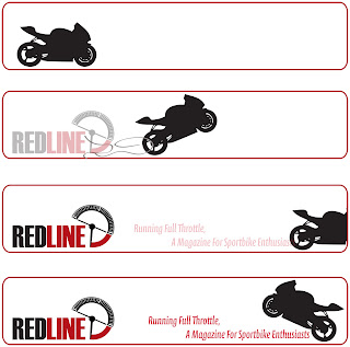
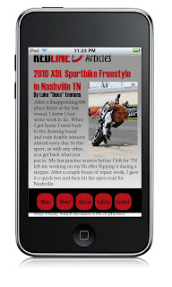
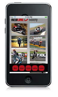
The second part of our assignment was to make apps for the ever popular iPhone. Basically, we had to make a splash page, main page, about page, article page, and another page of our choosing. I did a gallery page that users could get images for their own purposes, like wallpapers. This is how they turned out, and I'm pretty happy, if I do say so myself....and I do!
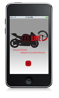
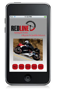
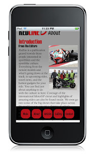
Our first assignment was to design a banner ad of our choice and animate it using stills. Basically, use PDFs to show how it would progress on a site. I decided to advertise my own publication as if it were on another site. This is how it turned out.

The second part of our assignment was to make apps for the ever popular iPhone. Basically, we had to make a splash page, main page, about page, article page, and another page of our choosing. I did a gallery page that users could get images for their own purposes, like wallpapers. This is how they turned out, and I'm pretty happy, if I do say so myself....and I do!


May 28, 2010
From Print to Digital
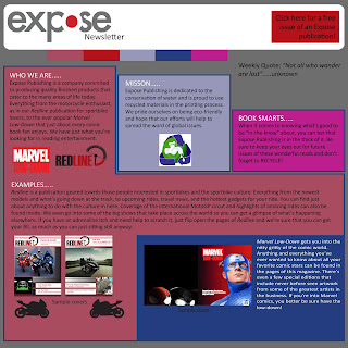
This week, we took our original brochure design and incorporated what it would look like if it changed to a digital newsletter. Keeping a lot of the elements of the brochure, it was actually fun to morph it to a digital piece. Since I wasn't entirely happy with my brochure to begin with, it gave me the chance to tweak it some to the point where I was a little happier with it. I tried to make the newsletter easy to follow and read while still making it interesting. I gave just enough info to interest the reader in further looking into what Expose Publishing offers.

May 21, 2010
Website ideas and brochure
OK, so I haven't been a very good blogger, and I apologize for that, but I'm really not good at this sort of thing, but here goes....
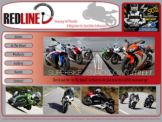
Over the past few weeks, we've been given a few assignments, some of these consisted of making a web page that would be cohesive with out publication. In other words, we needed to design at least two home pages that use the same colors, similar layouts, and have a theme that matches our own publications. Keeping in mind the amount of screen space used, where ads and buttons would go, and what content we wanted used. I think they turned out pretty good, but you be the judge...

As for another assignment, we needed to come up with a tri-fold brochure that tells about our "class" publication company Expose. We decided as a class that we would be eco-friendly, therefore use recycled paper and be involved in water conservation. Being that I only have the limited time in class and no computer/software at home to work on these projects, I just quickly threw together an idea, and here it is.
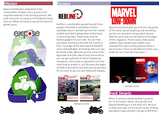
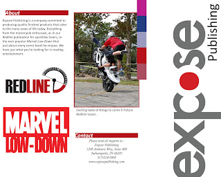
I'm not exactly happy with it, but being that many of these assignments are "works in progress" that can be revised, it's alright as far as layout goes for design one. Until next time. Thanks for reading!
Over the past few weeks, we've been given a few assignments, some of these consisted of making a web page that would be cohesive with out publication. In other words, we needed to design at least two home pages that use the same colors, similar layouts, and have a theme that matches our own publications. Keeping in mind the amount of screen space used, where ads and buttons would go, and what content we wanted used. I think they turned out pretty good, but you be the judge...


As for another assignment, we needed to come up with a tri-fold brochure that tells about our "class" publication company Expose. We decided as a class that we would be eco-friendly, therefore use recycled paper and be involved in water conservation. Being that I only have the limited time in class and no computer/software at home to work on these projects, I just quickly threw together an idea, and here it is.


I'm not exactly happy with it, but being that many of these assignments are "works in progress" that can be revised, it's alright as far as layout goes for design one. Until next time. Thanks for reading!
April 23, 2010
The Beginning
OK, so I missed the first week of class and am in the middle of playing catch up.......not all that much fun, but a student's gotta do what a student's gotta do. For my first "quickie layout" in class, it turned out to be a bit of a flop in my opinion, but I had a few things to come up with, like a logo and how I wanted it to look, so I guess that's my only excuse. I haven't gotten a chance to get our textbook yet, so I can't really comment on the reading @ this point, but I obviously still have quite a bit to learn when it comes to "crunch time" projects. Hopefully I'll get better as the quarter progresses.
As far as my color scheme for this project, right now I'm sticking with reds, greys, black, & white, although there may be a change or two along the way, you can follow along with that here if you like. Hopefully this won't become overly boring and monotonous, and if you have any suggestions, feel free to let me know. Constructive criticism is a good learning tool and any good points you'd like to point out are appreciated as well. Thanks!
As far as my color scheme for this project, right now I'm sticking with reds, greys, black, & white, although there may be a change or two along the way, you can follow along with that here if you like. Hopefully this won't become overly boring and monotonous, and if you have any suggestions, feel free to let me know. Constructive criticism is a good learning tool and any good points you'd like to point out are appreciated as well. Thanks!
Subscribe to:
Comments (Atom)